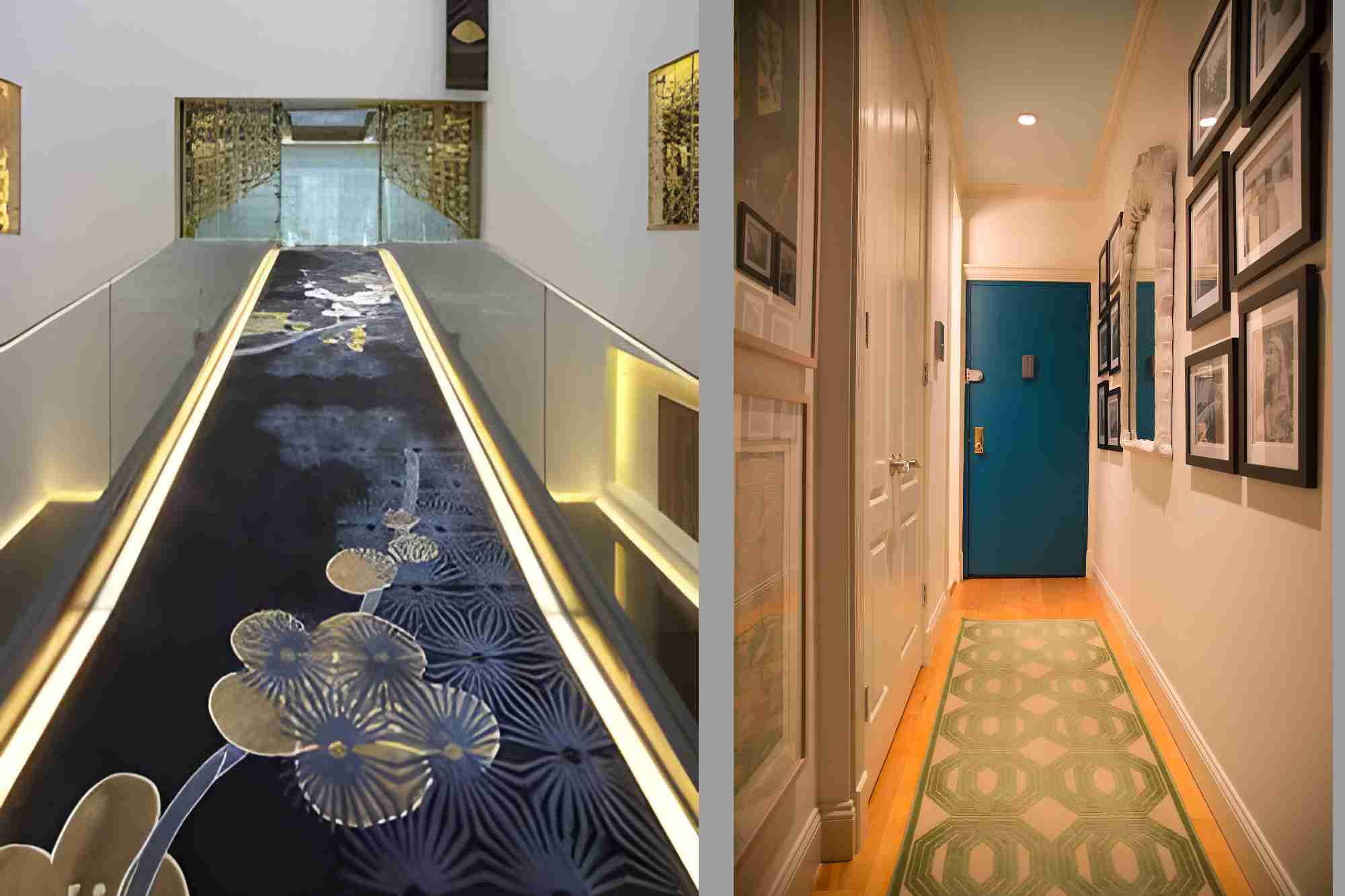
Hallways have long been ignored as a meaningless transit space in home and office design. But these overlooked corridors actually offer exciting possibilities to inject personality and utility into a property, if used creatively.
The lowly hall deserves more respect—here’s why hallways are an underutilised space in British interior design.
Wasted Real Estate
The average medium to large-sized home may have up to three hallways that link various rooms together. Office spaces have even more corridors connecting different areas and departments. All of that space is usually empty except for floors and walls, which is a tremendous waste of valuable interior footprint.
A clever repurposing of a dull hallway could add extra storage, seating, decorations, or amenities like a mini home office or library.
Missed Design Opportunities
Very few property owners explore innovative design ideas for hallways. Most are willing to leave these necessary circulation routes as bare and boring voids between actual living or working areas. This oversight misses out on ways to improve room flow, add decorative flair, and multiply functional zones in a space.
With the help of a luxury interior designer, London, reimagined hallways lend themselves well to the mixed-use ethos popular in contemporary interior design. Niches for lamps, mirrors, artwork, shelving, or even small pieces of furniture could all turn a ho-hum hallway into a visually pleasing, multi-use area.
More radical hallway makeovers might house foldaway workstations or comfy window seats.
Unleashing Creativity
Repurposing corridors taps into interior designers’ creativity too. The long, narrow proportions of hallways constrain possible uses for the space. This limitation sparks ingenious solutions, like built-in storage benches, modular coat hooks, or suspended planting racks overhead.
Experimenting with striking colours, textured paint finishes, floor materials, or lighting effects also helps hallways stand out as captivating zones rather than just secluded passageways.
These kinds of innovative flourishes highlight talented designers’ skills. There’s no better place to showcase their abilities than a well-executed hallway revamp.
Warm Welcomes
Most guests visiting a home only ever see the hallways on their way to meet the hosts. So, this first impression zone shapes visitors’ perceptions, whether we realise it or not.
Yet few householders make an effort to decorate hallways for maximum visual impact. Just adding some stylish hooks, mirrors, plants and art transforms a mundane space into a pleasing prelude to the rest of the home. It’s also a quick win for creating warm welcomes for arriving guests.
Lost Opportunities in Offices
Commercial spaces suffer from the same lack of attention to their abundant hallways too. Most office hallways sport old carpet, scuff marks and not much else—but they could be so much more functional.
Repurposed corridors in offices might offer informal meeting nooks with Wi-Fi, robust soundproofing and whiteboards. Seating areas encourage collaboration between colleagues when a full-fledged conference room is overkill.
Employees can also benefit from hallway snack stations, device charging points, and lockers.
By overlooking hallways as dead zones in office layouts, companies lose out on morale-boosting amenities for their workforce. Commercial hallway overhauls represent an easy way to upgrade company culture.
In today’s maximalist approach to interior design, no space can be wasted—not even the humble hallway. With a bit of creative thinking, these unloved circulatory byways offer exciting opportunities to improve aesthetics, usage, storage solutions and hospitality in our built environment.
It’s time to finally appreciate the incredible potential of hallways.
Please explore our site for more exciting content if you like this article.


